What are Responsive designed Websites?

With the advent of the smart phones and the increased usage of a range of devices like tablets, laptops, desktops, phablets, gaming consoles, smart phones and wearable devices. The websites have to be designed in a way that is compatible to all mediums. Also the respective website has to represent itself similarly in all devices and adapt itself without undergoing a change in its appearance, colour and general layout. Therefore, keeping these factors in mind, responsive web designing basically incorporates a focused shift on how to design and devise websites consistently. The representation of the content and the design has to be optimized uniformly for all devices.

Australian smartphone owners
Used Internet on smartphone daily. 92%
Used Search engines on smartphone daily. 60%
Visited the website of a business or service after Local Search. 54%
  • A whopping 92% of smartphone owners accessed the Internet via their smartphones daily.
  • 60% of smartphone owners used Search engines on their smartphones daily.
  • 54% of smartphone owners visited the website of a business after performing local search on their smartphones.

Responsive web design (RWD) is a web designing approach intended to build websites to provide a best possible viewing experience. This basically entails ease of use, readability, easy to navigate, scroll and employ other functionalities with minimal alteration to the original website structure and design, irrespective of the device.

It is said that responsive websites layout, in a way respond to their surroundings. The design in a way just responds to the requirements of the users’ and the gadgets or devices they are using. The websites designed in this platform are very adaptive with a range of fixed layouts within and on the other hand responsive with several fluid-grid layouts. So in a nutshell, the web design changes according to the resolution of the device.
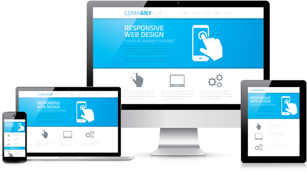
Responsive Design
The approach of a RWD or Responsive website design is that it adopts a designated fluid size for smaller websites and a fixed breadth for larger and medium-sized websites. The images used in this form of designing are referred to as context-ware. Therefore, these images will respond to different resolutions in accordance to the device used.

Responsive web designing is completely different from designing for the regular traditional static websites. This type of designing is quickly developing, rapidly gaining ground, increasingly getting popular and garnering quick acceptance across all mediums. In this form of designing, currently, there are some accepted design models that work well across any desktop or mobile device.

Responsive web design patterns are quickly evolving, RWD is definitely here to stay. This is soon going to be the norm in web designing as increasingly, owing to time, convenience, accessibility; people are surfing online on their Smartphones or other adaptable devices as compared to the traditional computers.

When The Ocean Technology Group conducted an in-depth study into the Smartphone penetration into our lives, the statistics were mindboggling. The numbers revealed that most users’ regularly accessed internet regularly on their phones or related devices. Also most searchers used search engines for their surfing and many a time, after conducting a local search, they would seek the specific websites. This just revealed the increased use of mobile devices, its market penetration and acceptance across all age groups, genders and location.

We provide a full range of Digital Services and Digital Solutions to clients in Australia

All our packages are designed to give you ultimate control, unrivalled support, great results and more time to focus on running your business.

The future in web designing is going to be Responsive. Have you entered the bandwagon?

Therefore, as a heads-up to all our clients’ and potential clients’ we would like to enlighten you about ‘going mobile’. If your website or any of your online web presence is not optimized to appear uniformly across all devices including phones and computers, then you may lose out. You may lose out on your existing clients’ or even fail to attract potential clients’ because your website is not appealing or eye-catching. And the reason as we had mentioned earlier is to do with incorporating responsive web designing. If your existing website doesn’t fit the norm, then it would be a good idea to revamp your website design. If you are a new business, then it is best to create the website as a responsive website as this is will prove to be a game changer with a keen eye on the future.

The advantages of adapting a Responsive Web design with us, The Ocean Technology Group would be:
  • Huge cost savings, as you can have one type of website visible across all devices.
  • Better page rankings, with better search optimised features.
  • The website design is very user-friendly and adapts well in any device.
  • Maintenance and updating the website is relatively low.
  • Reduced web-hosting cost.
  • Assured increased search traffic and more visitors to your website that will result in positive conversions.

And all this and more when coupled with our state-of-the-art expertise, knowledge experienced personnel who specialise in Response Web Designing and as we have already tapped the market in this genre and have catered to numerous clients’, we are definitely worth considering!

Optimize the performance of responsive design websites with The Ocean Technology Group.
Desktop vs Mobile Browser Statistics (PHP CODE PENDING)
  • Mobile Internet usage is growing (currently 15% of total Internet usage in Australia) and will continue to grow at a steady pace.
  • Worldwide trends show that people are buying fewer desktop computers and buying a lot more smartphones and tablets.
  • More than half of all smartphone owners in Australia use their mobiles to search and visit the website of a business after searching.
  • If your website is not well-optimised for mobile users, the poorer experience will turn them away to better optimised competitors’ websites.
  • Having a website which is responsive will provide an equally elegant experience for users across desktop, tablet and mobile devices.
  • Allocate a business budget to creating a responsive website before the end of this financial year to prevent possible exodus of mobile visitors in 2015.

We’re Ready to Bring Bigger
& Stronger Projects